Hello everyone! Today I am writing about the color wheel and the emotional effects that colors have in our lives!!! Believe it or not color can determine our mood. So lets be careful what colors we choose when selecting that perfect color for that nursery, bedroom, or perhaps your restaurant! Below is an explanation on color and what they represent.
The chart above demonstrates the Primary, Secondary, and Intermediate/Tertiary colors on the color wheel. Below you will find what these colors represent.
Primary Colors: Red, yellow and blue
In traditional
color theory (used in paint and pigments), primary colors are the 3
pigment colors that
can not be mixed or formed by any combination of
other colors. All other colors are derived from these 3 hues.
Secondary Colors: Green, orange and purple
These are the colors formed by mixing the primary colors.
Tertiary Colors: Yellow-orange, red-orange, red-purple, blue-purple, blue-green & yellow-green
These
are the colors formed by mixing a primary and a secondary color. That's
why the hue is a two word name, such as blue-green, red-violet, and
yellow-orange.
Color Harmony
Harmony can be defined as a pleasing arrangement of parts, whether it be music, poetry, color, or even an ice cream sundae.
In visual experiences, harmony is something that is pleasing to the
eye. It engages the viewer and it creates an inner sense of order, a
balance in the visual experience. When something is not harmonious, it's
either boring or chaotic. At one extreme is a visual experience that is
so bland that the viewer is not engaged. The human brain will reject
under-stimulating information. At the other extreme is a visual
experience that is so overdone, so chaotic that the viewer can't stand
to look at it. The human brain rejects what it can not organize, what it
can not understand. The visual task requires that we present a logical
structure. Color harmony delivers visual interest and a sense of order.
In summary, extreme unity leads to under-stimulation, extreme
complexity leads to over-stimulation. Harmony is a dynamic equilibrium.
Some Formulas for Color Harmony
There are many theories for harmony. The following illustrations and descriptions present some basic formulas.
1. A color scheme based on analogous colors
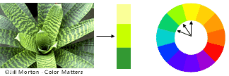
Analogous colors are any three colors which
are side by side on a 12 part color wheel, such as yellow-green,
yellow, and yellow-orange. Usually one of the three colors predominates.
2. A color scheme based on complementary colors
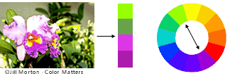
Complementary colors are any two colors which are directly opposite
each other, such as red and green and red-purple and yellow-green. In
the illustration above, there are several variations of yellow-green in
the leaves and several variations of red-purple in the orchid. These
opposing colors create maximum contrast and maximum stability.
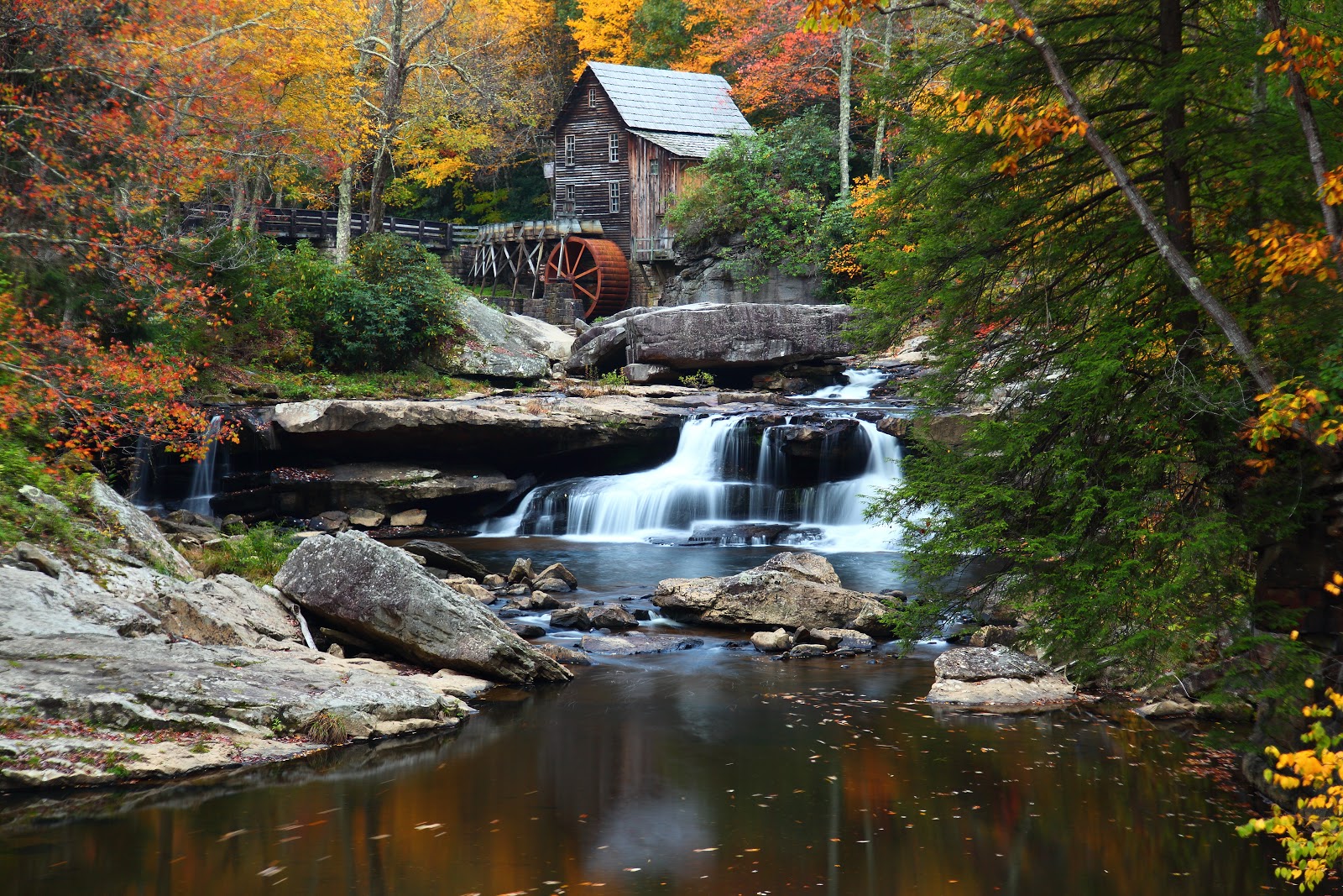
3. A color scheme based on nature
Nature provides a perfect departure point for color harmony. In the
illustration above, red yellow and green create a harmonious design,
regardless of whether this combination fits into a technical formula for
color harmony.
Emotional
Effects of Colors
Colors have different psychological
effects, positive as well as negative. This point must be kept in mind while
choosing colors in your design since various colors convey varied meanings. Now that we know the theory of color, lets choose the perfect color for our space!
Red
Red is the color of energy, it’s
bold, it’s powerful, it’s vibrant. It has the longest wavelength (the distance
over which the wave’s shape repeats). It’s the color of effectiveness,
excitement and liveliness. All over the world we follow red traffic light to
stop, its visibility is the strongest amongst all other colors because of its
highest wavelength. On the other hand its negative impacts can be aggression,
visual disturbance and strain. You live in a red room for a day and you will go
crazy, it has to be complimented with other colors to make it subtle.
Yellow
Yellow is a very emotional color, it
is the color of self esteem, confidence and optimism. After red yellow has the
longest wave length, appearing to be strong from a distance. World over yellow
cabs can easily be seen, sunflowers, daffodils appear to be friendly. Contrary
to this it also communicates few negative values like depression, hatred and
anxiety.
Blue
Blue is the color of intelligence,
vastness, royalty, serenity, coolness and tranquility. Sky appears blue and
gives calm effect, water appears blue and gives peace of mind. Blue appears to
be the favorite color of most of the people but on the other hand it is also a
color of coldness, unfriendliness and unemotional.
Green
Green is the most refreshing and
cool color. Green is the color of life, fertility, reassurance, peace, harmony,
balance. Nature is green and how soothing it is to our eyes. Not a single tree
in this world is of the same green tint or shade, yet it appears to be so full
of life and create environmental beauty. As for its negative traits it is
the color of Boredom, stagnation, blandness and enervation.
Violet
Violet is color of truth, luxury and
spiritual awareness. It has the shortest wavelength therefore it is considered
to be weak also. A color of introversion and suppression. It is associated with
deep contemplation and royalty, meditation and quality.
Orange
Orange gives warmth, comfort,
security, passion, fun and frolic. Due to the mixture of red and yellow it
gives stimulation and sensuality. Use of too much orange gives a feeling of no
serious attitude and gives a feeling of deprivation if used with black.
Pink
Pink is a cute color, very feminine,
love and tranquility. Though pink is a tint of red but it soothes rather than
stimulates. It gives comfort and suggests grace and elegance. Sometimes too
much pink looks physically weak and appears full of flaws. It creates impact of
inhibition.
Grey
Grey is a neutral color, not giving
a direct psychological effect. It may represent emptiness and dullness. It
gives impression of dampness and right tone of grey must be used otherwise it
may make your composition depressive.
Black
All colors are absorbed in black.
Black is glamorous, graceful, efficient and security. Women wear black to
attract, they look sophisticated. Black creates hindrance since there’s no
light no reflection. It works perfectly with white thus the co relation is
either alternation or repetition. Black is the color of mourning also. Too much
black creates heaviness and scary look.
White
White is pure, clean, hygienic,
innocent and simple. White is total reflection. It gives perception of space,
too much clutter in a design can be overcome by using spaces of white. The
negative effect of white is that it makes other colors used with it cold and
unfriendly. Can create a diminishing effect.
Brown
Brown is the color of earth, rugged,
serious, old, and ancient. Rustic look can very well be created with this
color. Since brown is the combination of red and yellow with much larger
percentage of black, it also gives the same seriousness as black but in a
warmer way. It is natural and supportive but at the same time it is too non
humorous and appears heavy.


